CO-04 (Special Election) See Full Big Line

(R) Greg Lopez

(R) Trisha Calvarese

90%

10%

President (To Win Colorado) See Full Big Line

(D) Joe Biden*

(R) Donald Trump

80%

20%↓

CO-01 (Denver) See Full Big Line

(D) Diana DeGette*

90%

CO-02 (Boulder-ish) See Full Big Line

(D) Joe Neguse*

90%

CO-03 (West & Southern CO) See Full Big Line

(D) Adam Frisch

(R) Jeff Hurd

(R) Ron Hanks

40%

30%

20%

CO-04 (Northeast-ish Colorado) See Full Big Line

(R) Lauren Boebert

(R) Deborah Flora

(R) J. Sonnenberg

30%↑

15%↑

10%↓

CO-05 (Colorado Springs) See Full Big Line

(R) Dave Williams

(R) Jeff Crank

50%↓

50%↑

CO-06 (Aurora) See Full Big Line

(D) Jason Crow*

90%

CO-07 (Jefferson County) See Full Big Line

(D) Brittany Pettersen

85%↑


CO-08 (Northern Colo.) See Full Big Line

(D) Yadira Caraveo

(R) Gabe Evans

(R) Janak Joshi

60%↑

35%↓

30%↑

State Senate Majority See Full Big Line

DEMOCRATS

REPUBLICANS

80%

20%

State House Majority See Full Big Line

DEMOCRATS

REPUBLICANS

95%

5%

Generic selectors
Exact matches only
Search in title
Search in content
Post Type Selectors
August 30, 2013 11:29 AM UTC

A Few Words About The New Colorado Logo

  • 25 Comments
  • by: Colorado Pols

UPDATE: Brand Colorado clarifies conflicting reports about the source of funds to develop the new brand:

Just to clarify on the cost…[t]he Statewide Internet Portal Authority and the Colorado Tourism Office contributed a combined $800,000 to the project. But, corporate sponsors including Crocs, Boulder Brands and Crestone Capital and others also contributed funds to Making Colorado. Additionally, companies including Atomic 20, Linhart Public Relations, Made Movement, Karsh Hagan, Sterling Rice Group and Egg Strategy, as well as numerous individuals and freelancers, contributed thousands of hours of pro bono services, totaling more than $1.5 million. 

It is estimated that the new state brand could save some state agencies, like CDOT, as much as $300,000 per year in marketing expenses. Multiply even a fraction of that number by 22 state agencies, and you can see how the new brand will actually save the state money.

—–

newcoloradologo

As the Denver Business Journal's Ed Sealover reports:

After a year-long search that cost state officials some $1.1 million, Aaron Kennedy, Colorado's chief marketing officer, officially will announce at the Colorado Innovation Summit Thursday that they have settled on a triangle-shaped mountain reminiscent of the state's license plate to be the official state brand.

The brand will be used on all state vehicles and agencies, and also can be attached to the products of companies that design, manufacture or grow things in the state, in order to make people outside Colorado think positively about the culture here…

Though as the Denver Post's Steve Raabe reports, not all items "manufactured or grown" within the state of Colorado need apply:

"Everybody says just use the C," Hickenlooper said referring to the red "C" filled with a golden circle on the state flag. "The problem is we don't control it, and it's on a lot of things, escort services and marijuana shops, that the state doesn't want to be identified with." [Pols emphasis]

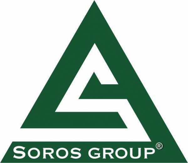
Setting aside the dissing of Colorado's flag, which we happen to like, we're not really sure about Gov. John Hickenlooper's rationale here. For one thing, the state's new logo has been likened to a hazard warning sign, which is an extremely popular basis for all kinds of stoner art. That means this new logo is more or less certain to be incorporated in some form into a "marijuana shop" design.

As for conveying a "unique brand," Twitter user Janus303 addresses the topic of uniqueness pretty well: 

greenlogos

And our personal favorite (cue conspiracy theorists):

sorosgp

Bottom line: there's nothing about this logo to get overly upset about, given that, well, everyone's a critic, and reportedly no taxpayer dollars were expended on its design (see clarification above). We don't get all wrapped up in consultant gobbledegook about the esoterics of branding, in fact we find that stuff cheesy–but it's fine for the state to have one. To the extent that the logo looks vaguely like the classic Colorado license plate, we're okay with that. It's not really overwhelmingly awesome or anything, but we don't think it should be. Simple and unpretentious is fine with us.

But like we said, everyone's a critic, so your mileage is free to vary. If you have a better suggested logo, we'd love to see it, even though the search is over.

Comments

25 thoughts on “A Few Words About The New Colorado Logo

  1. The wingnut twitterverse was agog yesterday…something about Hickenlooper trashing the Colorado flag, being a bartender and selecting a coaster.  Glad to see the party bringing its A game… 

  2.  The just not very pretty plain green and white doesn't appeal to me. Maybe the "CO" in a nice golden yellow for our sunshine to add some color?  But I agree, it's nothing to have a cow over.

  3. We've all seen great graphic design, and we've seen really poor graphic design. Even if we're not artists we know what's good and what's not. This is not.

    And whoever's $1.1 million was spent, it's about $1.099 million too much money for Colorado's new warning sign. Pols, you say "reportedly no taxpayer dollars were expended." But Sealover is quoted as saying "After a year-long search that cost state officials some $1.1 million. . ." Seems contradictory.


    1. The Denver Post pegs the overall cost at $2.3 million, but only $800k of actual cash outlays that appear (to my uninformed eyes) to be state money:

      Those individuals and their firms provided pro bono services that Colorado officials value at $1.5 million. Another $800,000 was contributed by the Colorado Tourism Office and the Statewide Internet Portal Authority, which operates state government websites.

      http://www.denverpost.com/business/ci_23969108/colorado-rolls-out-new-logo-and-slogan-state?source=most_viewed

      It does strike me as pretty dull and uninspired.  Probably cheap and easy to print onto product packaging, which probably is considered an advantage, given it's intend use.  Esthetically, something with more color and dimensionality would be more pleasing to the eye.

  4. This is as much a disaster as when the mountains were taken off the license plates in 77.  And as stupid as flipping the white and green when we finally got the mountains back.

  5. Maybe Soros' check is in the mail to the state?

    Have to agree with the rest – however many millions were spent in search of this logo, it was that many millions too many. Pick a group of 5 people with some sense of visual design and an understanding of what the logo was supposed to do and they could have come up with this and 10 better ideas in an afternoon. Add a trademark attorney and you're done.

    1. Not "dissed" — ignored!!!  And, No — that's a rather lovely watermelon-green if you ask me . . .

      (And that snow on the mountain?  Inspired by Greg Brophy's haircut, no doubt.)

    1. @Dgdr,  Absolutely.  The logo looks just like the warning label for carbon monoxide

      danger.  Evidently, when one flunks chemistry, one goes into advertising.  Who knew?

      On a serious note, for those few, thankfully it is only a few, people who have lost loved ones to CO poisoning, the logo is unbelieveably painful to see. 

    1. OK. The logo isn't high on my list of things to get upset about but I just took another look at the ancient Crime Check Colorado sticker on our front storm door, left there by the previous owners and probably dating back to the 80s. It's similar to this new logo except it's more interesting with twin peaks and more color. Aren't we supposed to be colorful Colorado? Couldn't we at least have a three color logo and do any of the colors have to be industrial warning sign green. Why not just the traditional flag C  instead of the CO? And the plain font Colorado underneath but in no way integrated into the design just lays there like an after thought. That's what you get from our greatest graphic designers?

      That said, I hope they don't spend another million or two starting from scratch. Maybe they could just find some artsy High School computer graphics loving kid to pay 1 or 2 K  and a scholarship to come up with something nicer.  Say by next week? That should be plenty of time.

  6. So, they did a survey and not to many people knew the red 'C' with the gold orb in the middle on the white and blue stripes background (our flag) stood for Colorado.  But they recognized our license plates immediately.  Okay.  Business sense says when times are slow, advertise! So a new brand for the advertising.  Okay.  I get the intention and the reasoning.  Still I gotta say, not real impressed.  But then, I live here, do business here, vacation here, love it here.  So it's not people like me they are trying to attract.  They already got me, lol.  If they'd copied the license plates, instead of making the peaks so extreme, might have been better.  It's a little too stylized and doesn't look terribly inviting.  

Leave a Comment

Recent Comments


Posts about

Donald Trump
SEE MORE

Posts about

Rep. Lauren Boebert
SEE MORE

Posts about

Rep. Yadira Caraveo
SEE MORE

Posts about

Colorado House
SEE MORE

Posts about

Colorado Senate
SEE MORE

94 readers online now

Newsletter

Subscribe to our monthly newsletter to stay in the loop with regular updates!