 October 04, 2011 01:36 AM UTC
The Great Colorado Pols Yard Sign Catalog List
 22 Comments
- by: Colorado Pols
(We’ve got a lot of yard signs still to add to the list below, but with Election Day around the corner, here’s a reminder to keep sending in pictures of signs to webmaster@coloradopols.com. – promoted by Colorado Pols)
 NOTE: Since this is a bipartisan project, we’ve introduced a new rating system. Each sign will now be rated on a scale of 1-5 “Elephonkeys.”
We asked you to send in pictures of yard signs, and so far you delivered. We want this catalog of yard signs to continue to grow, so please snap some pics of yard signs whenever you see them and email the photos to us at webmaster@coloradopols.com.
This list will be continually updated, so we’ll keep a link to it in the right sidebar. We will rank all yard signs that we have pictures of in order from best to worst. These rankings have nothing to do with political party or office — we’re purely considering the strength of the design itself. We’ve all seen good and bad signs, and the bad ones are often the most memorable; just because it looks nice in Photoshop doesn’t mean it is a good design for a yard sign.
Bad color schemes (red typeface on a blue background), excessive wording and a logo that obscures the candidate’s name are all big mistakes. On the other hand, a good yard sign lists the candidate’s name (or the ballot measure) in as large and readable a typeface as possible, along with the office they are contesting.
And now, on with the yard sign catalog list thing…
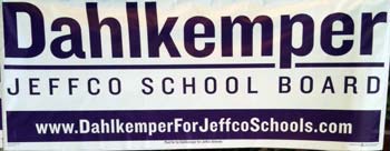 LESLEY DAHLKEMPER
Jefferson County School Board, 2011

This is a very good sign. It tells you everything you need to know with just a glance: the name of the candidate, the office, and the candidate’s website. There is no first name on the sign, but her last name is so distinctive that it isn’t necessary.
We particularly like that Dahlkemper doesn’t get into the details of which “district” she is running to represent. This is a common mistake that drives us nuts — 9 out of 10 voters have no idea what “number” district they live in, be it legislative, city council, school board or congressional seat. Voters don’t need to know the number of their district, anyway, so why bother with putting it on a sign? Dahlkemper’s approach is perfect: “Jeffco School Board.” Voters don’t need to know more than that from the sign.
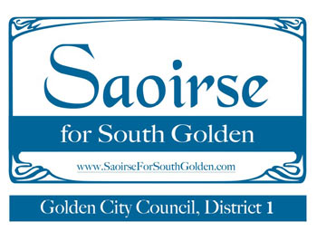 SAOIRSE CHARIS-GRAVES
Golden City Council, 2011

This is almost a great sign, but it’s still a very good one. Here is an excellent example of how to have a distinctive-looking sign without sacrificing name ID. It helps, of course, to have such a memorable — if completely unpronounceable — first name.
What keeps this from getting 5 “Elephonkeys” is the wasted space at the bottom, where it says “Golden City Council, District 1.” We would have just replaced “South Golden” with “Golden City Council,” and made everything else larger while not messing up the nice rectangular pattern.
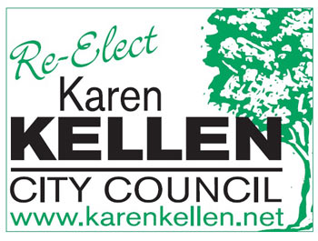 KAREN KELLEN
Lakewood City Council, 2011

Here’s another sign that almost has it perfect. We love the use of the tree logo and how it takes up just a small portion of the sign while still standing out. There’s also no unnecessary wording.
What holds this sign back from a ‘5’ rating is the use of “Re-Elect.” For one thing, we wouldn’t use “re-elect” on a sign in a political climate like this one; poll after poll shows that people aren’t happy with many incumbents, and while that may not be the case on every local level, it’s still an unnecessary risk. The bigger issue is that “Re-Elect” is way too big and takes up too much space — space that should be used to make the name bigger. If you insist on putting “re-elect” on the sign, at least don’t make it so prominent.
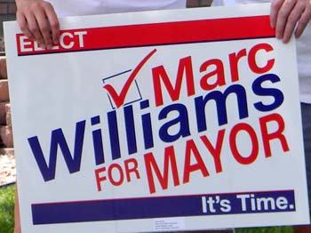 MARC WILLIAMS
Arvada Mayor, 2011

This is a good sign because it’s easy to read, though we’d ditch the “ELECT” on top of the sign — particularly since there is also a checkbox graphic (we’ve never understood why people put “elect” on a sign; the “Marc Williams for Mayor” part is pretty explanatory).
What really stands in this sign is the simple “It’s Time.” message. What does he mean by “It’s Time”? We have no idea, but it’s a rare example of a vague tagline that we actually think is effective. We really hate the all-too-common strategy of picking three words and putting them next to your name (Leadership. Experience. Mozzarella.) because it takes up space that should be used for your name and the words are completely meaningless and forgettable anyway. But “It’s Time.” is different.
If you’re disgruntled with Arvada government, you might take “It’s Time” to mean that “It’s Time for a Change.” If you’re familiar with Arvada politics, you might think it means that “It’s Time” for Marc Williams to become Mayor because you think he’s done a good job at whatever he did before. “It’s Time” could mean a lot of things, but we don’t see a negative connotation.
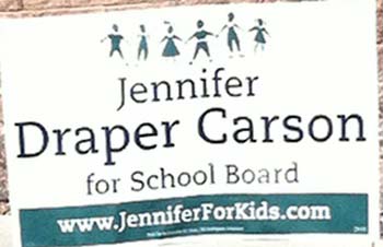 JENNIFER DRAPER CARSON
Denver School Board, 2011

This is a pretty good sign that would have been a very good one had they spent just a little more time tightening things up.
We like the simple graphic of the paper doll kids — this is a good example of how to add a little meaningful pizazz to your yard sign without going overboard (see: GIAVANNI, MARCUS). But the size and spacing of the graphic just seems a little off; we might have made it a little shorter but expanded the graphic across more of the sign.
We also don’t like how much white space they left available. You could drop the word “for” and make “School Board” larger, but the biggest mistake is that the candidate’s name doesn’t dominate the sign. Look at the sign above for Lesley Dahlkemper and you’ll see what we mean. The single most important thing for any lower-tier race is name recognition. In this case, perhaps “Jennifer Draper” could have been smaller and “Carson” made much larger.
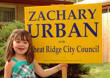 ZACHARY URBAN
Wheat Ridge City Council, 2011

Simple is good when it comes to yard signs. This is probably an expensive sign, since it requires a little girl to hold one up (thank you, we’ll be here all week), but otherwise it does what a sign should do — the name is big, and it’s clear what Urban is running for without adding unnecessary details like the number of the city council district.
While we generally think that simple is best, this sign could use a little something extra to make it more eye-catching. It’s also missing the website address.
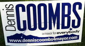 DENNIS COOMBS
Longmont Mayor, 2011

There’s a fatal flaw with this sign: it’s not clear what office Dennis Coombs is seeking. The word “mayor” is in small type smashed into a slogan smushed between his name and the mountain image at the bottom. This is fine for a website or a mailing, but not for a yard sign that people need to be able to read while driving.
The half-moon arc of the star shooting out of the mountain is a bit distracting and doesn’t add anything beneficial. More importantly, it takes up space that would have been better used to place the word “Mayor” in larger type. This is a good concept for a sign overall, but they kind of forgot about the purpose somewhere along the way.
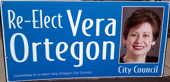 VERA ORTEGON
Pueblo City Council, 2009

This particular sign is a larger banner, and we don’t know if Ortegon’s yard signs looked the same. But we included this one because of the head shot picture. We’ve never understood putting a head shot on a sign — it’s expensive to include a full-color picture, and we don’t see where it helps you. We suppose you could argue that including a picture makes it more personal, but you also risk turning off voters who don’t like the photo.
And for all of you out there who might design yard signs — stop putting the name of the committee at the bottom. It’s not necessary anymore, and it just takes up space.
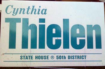 CYNTHIA THIELEN
State Representative, Hawaii (David’s mom)

Not a bad sign, though we would make “State House” bigger and get rid of “50th district” (as we’ve explained before, no voters know the number of the district they live in, so there’s no reason to put it on a yard sign). We assume the ‘R’ insignia means that Thielen is a Republican, and not that she trademarked the words “State House,” but that could be more clear as well.
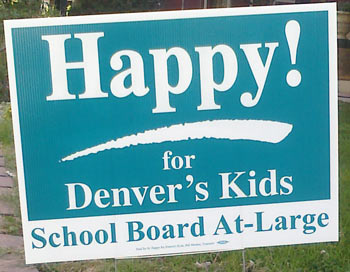 HAPPY HAYNES
Denver School Board, 2011

This is an interesting sign to discuss. It’s a fantastic sign…if you know that “Happy!” is short for Happy Haynes. But for somebody who already knows that, then the sign probably isn’t doing much good.
This sign violates one of the fundamental tenets of politics (in our mind, at least): don’t ever assume that voters are familiar with you or the office you are seeking. If you don’t know Happy Haynes from a Happy Meal, then this sign will make absolutely no sense to you. Who is Happy for Denver’s kids? What? It’s like a bad Abbot and Costello routine.
We also dislike the “At-Large” writing on the sign; it doesn’t matter to voters if you are running in a particular district or at-large, because they can only vote for whatever names are on the ballot. Happy would have been better off with just using “Denver School Board.”
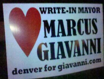 MARCUS GIAVANNI
Write-In Candidate for Denver Mayor, 2011

This isn’t a bad sign, really. If it weren’t for the humongous red heart that dominates the space, we’d almost approve of this.
The heart really ruins the sign, making it look like an advertisement for a Valentine’s Day sale at Walgreens or a reminder to get your flu shot. And what’s the message? Giavanni has a big heart? Giavanni advocates free love? Giavanni had triple-bypass surgery?
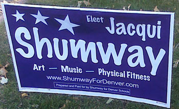 JACQUI SHUMWAY
Denver School Board, 2011

Art? Music? Physical Education? Sounds awesome…now, what in the hell are you running for?
This is a perfect example of a campaign that spent so much time thinking about a slogan and a visual image (and they still only managed the three stars thing?) that they completely forgot to put the second-most important thing on the yard sign: the office. Repeat after us: Name, Office, Website. Name, Office, Website.
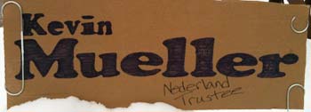 KEVIN MUELLER
Nederland Trustee

There’s not much to say about this sign, but we can’t hate on a guy who created a simple, readable yard sign with cardboard and a black marker. Not only that, but he appears to have located the largest paper clips we’ve ever seen.
Mueller’s sign is a lot cheaper than even the next on our list. The moral of the story: it doesn’t cost a lot to screw up a yard sign.
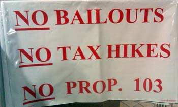 NO ON PROPOSITION 103
2011 Statewide Ballot Measure

This is why you should pay a graphic designer to put your sign together. Generally we prefer simple yard sign designs — just not this simple. We’ve seen more interesting signs for garage sales; and that’s the problem, because this Microsoft Word creation isn’t going to catch anyone’s attention.
On the plus side, the message is simple, though inaccurate, considering the “No Bailouts” message. Whoever put this sign together would have been better off eliminating the first line and using that extra space to create some sort of background image or graphic so that nobody could confuse it for a garage sale or a “we buy junk houses” sign. It’s also particularly important to list a website on a sign for a ballot measure, though we’re guessing that whoever came up with this design probably didn’t invest much (if any) time into creating a website.


 October 04, 2011 01:36 AM UTC
 22 Comments
 NOTE: Since this is a bipartisan project, we’ve introduced a new rating system. Each sign will now be rated on a scale of 1-5 “Elephonkeys.”
  LESLEY DAHLKEMPER
 SAOIRSE CHARIS-GRAVES
 KAREN KELLEN
 MARC WILLIAMS
 JENNIFER DRAPER CARSON
 ZACHARY URBAN
 DENNIS COOMBS
 VERA ORTEGON
 CYNTHIA THIELEN
 HAPPY HAYNES
 MARCUS GIAVANNI
 JACQUI SHUMWAY
 KEVIN MUELLER
 NO ON PROPOSITION 103
You missed the best one
We’ll post every sign.
Hilarious. When did CPols become so funny?
But I don’t agree 100%. Sometimes those sound bite words are very effective. “Hope”. “Change”. Obama/Biden. “Your neighbor / Your Voice!” Ed Perlmutter. Air / Water / Land. Ken Salazar. I’d actually like to see one that says, “Leadership. Experience. Mozzarella.” Sounds delicious.
He had hundreds of “Honk for Cronk” bumper stickers left over. Wish I kept some! (I’m glad he didn’t win — GOP.)
“Your Neighbor/Your Voice” is a slogan and a message. Picking three words to “describe” you as a candidate is lazy and ineffective; put the Intro to Marketing book down and give it some actual thought, or just leave it blank.
Exactly. The three word descriptor is waaaay overdone.
I can still have “Honk for Cronk”. 🙂
Vera first ran for office around 1990, when I was a little boy in Pueblo – she has always put her picture up on her yard signs, so she’s known throughout Southern Colorado for doing that the last 20 years
To her credit, she’s done some great work on Pueblo’s water board and has received many compliments as President of the City Council – seems like the yard signs have helped?
We’re making no judgments whatsoever on the candidates or how they perform if elected. This is purely a discussion of the appearance and effectiveness of particular signs.
The only one I’ve seen is on an on ramp with nowhere to pull over that I’m comfortable with (so how the hell did they plant it, then?) but it’s TERRIBLE.
They’re both on the same sign, and the slogan is “Vote for the Dads.”
Fellman and Dahlkemper are both mothers, so the Dads-are-better-than-Moms implication is just horrendous.
(and if they’re going to be like that, can they at least get the rest of their party to stop bitching about Polis and his partner having a baby? Dads are better? That one has TWO!)
🙂 Well said!
Too busy. Gives me a headache.
Saoirse= “Sir-shuh”
(Assuming this is a sign for Saoirse Charis-Graves). She says it like Sare- (ryhmes with mare) shuh.
And is going to replace the “50th District” with her website. Thank you.
It’s from a Representative that represented the area near the boarding school I was sent off to –
http://jordanfenster.files.wor…
That was an incredibly juvenile bout of giggling, and I just had to send that to two coworkers who wanted to know what was so funny… his legend grows.
Any relation to Gordon Shumway? (ALF)
the art, music and physical fitness, she really ought to have included that she’s running for school board. If you see this as some state rep’s campaign sign it looks like some new age-y aerobics instructor, probably an import from southern California, is running for the State Assembly.
My guess is that it’s a subliminal message to all those anti-choice zealots out there who are the most likely to vote.